Restaurant Layout Project
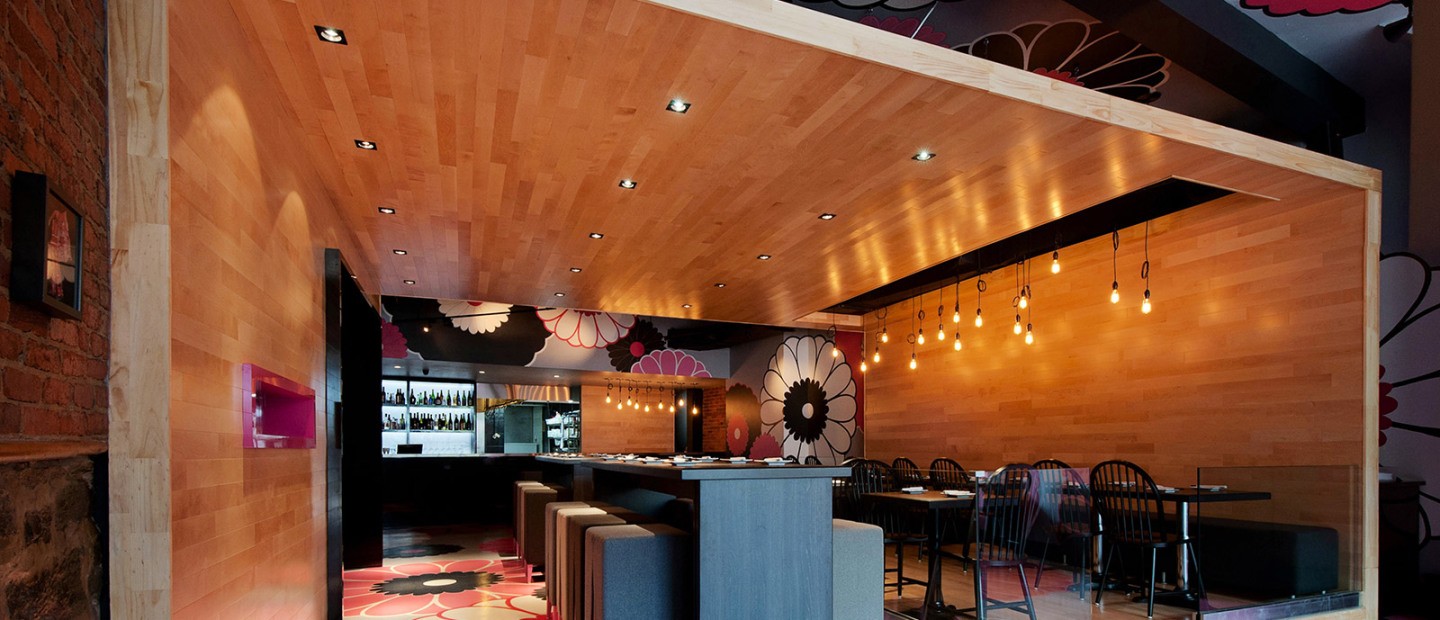
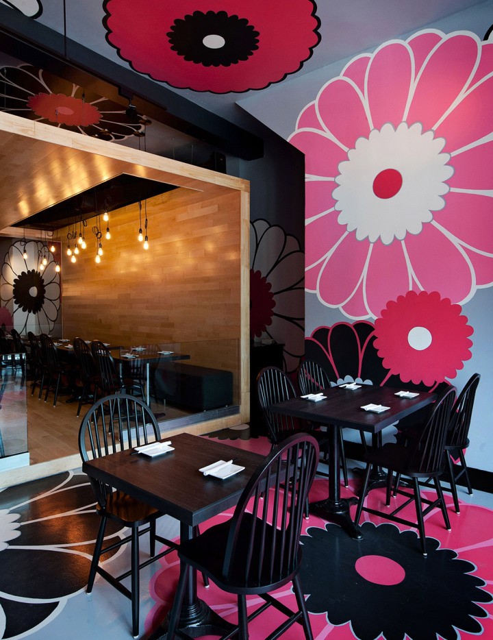
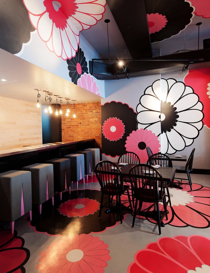
Taking advantage of the constraints of this restaurant interior design project, we broke the “cafeteria” effect of this old pizzeria (1,500 sq. ft.) and changed the circulation axis to divert attention toward the sculptural and oversized Kinoya dining room, the key element of the concept.
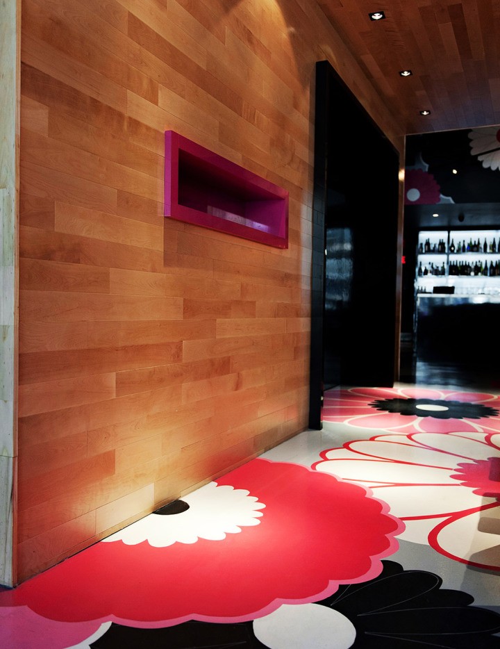
The purpose of our interior design was to gently bewilder: the wrap-around blond wooden strip creates an offset tatami box, thereby hiding the unsightly view of the corridor leading to the toilet at the back and the masonry cladding.
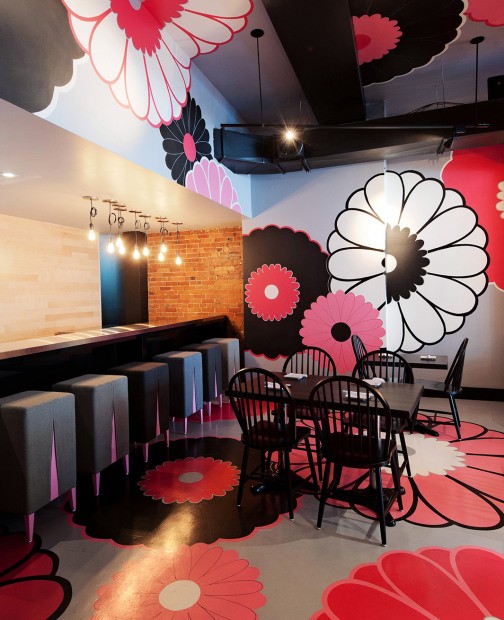
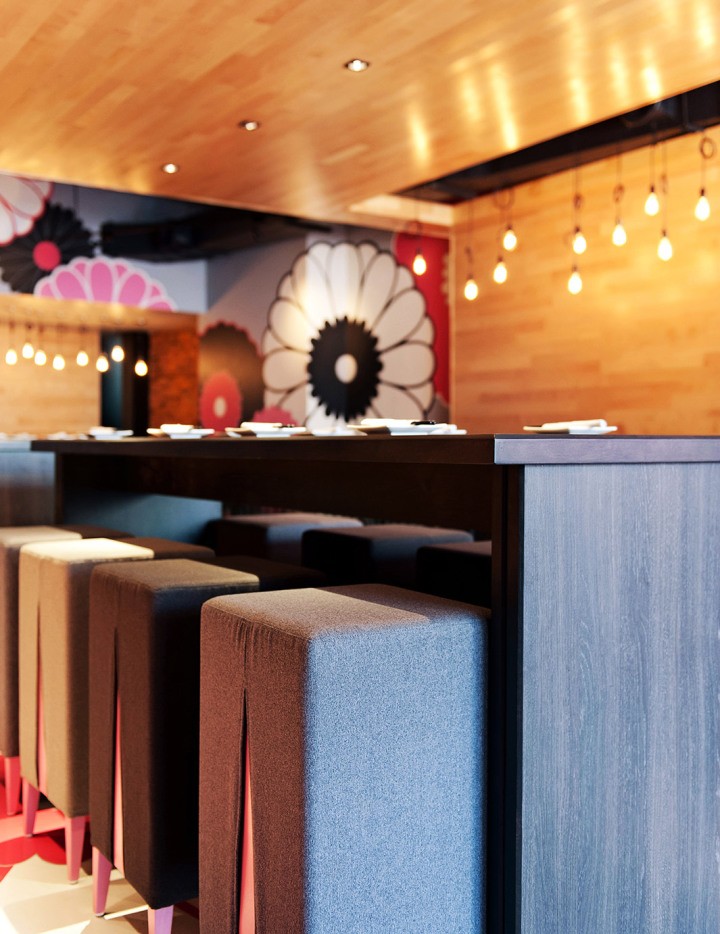
The new viewpoints are surprisingly smooth and promote a joyful atmosphere, revealing the lively personality of the young owners. The discreet lighting, the subdued materials and the dark, glossy and sexy tones bring refinement yet with a relaxed manner.
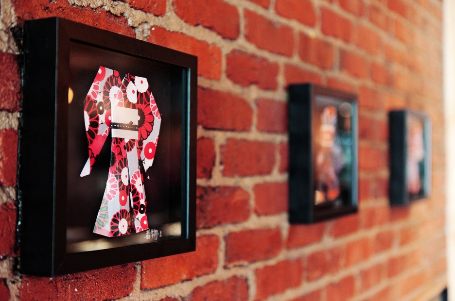
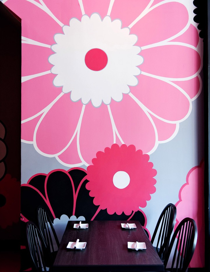
Winner of an international design award on two occasions, in Chicago, in 2013, and in London, in 2012, the space lets the architectural form and the authentic Japanese graphics appeal to the clientele with finesse
